Investigating human resources for health (mal)distribution in the DRC


My dissertation focuses on the human resources for health (HRH) distribution in the Democratic Republic of the Congo (DRC). As part of this work, I'd like to investigate the distribution of human resources for health across the health zones of the DRC. We'll start with an analysis of health workforce data from the routine health information system.
Obtaining health workforce data
There are few reliable sources of health workforce data in the DRC. I'll be using data from the routine health information system (SNIS). We've previously used R to download the health pyramid with SNIS data.
We'll be using the same scripts developed in our previous post to grab the health zone org unit tree:
# get only health zones
orgUnits <- getOrgUnitTree()
hz <- orgUnits |> select(prov_code, prov_name, hz_code, hz_name) |> distinct()

# now we have our health zones!
# we can sanity check them - there should be 519, as in the humdata map
dim(hz)
# [1] 519   4
We're interested in the human resources data elements, so we'll take a look at what data elements may be in the database.
# grab all data elements.
dataElements <- getDataElements()

# visiually inspect them for the correct data elements

# pull out the human resources data elements
hrh.de <- dataElements |>
  filter(id %in% c("X2BAHvCNuB8", "MtQbqqRai95", "ezeEllgXATH", "Y0v8wAu2OQe", "ehTcME2KSyk", "yVTpy45Jvtp", "HLqMwVoXR5H"))

print(hrh.de)
This provides us with seven of the data elements used routinely:
| displayName | id |
|---|---|
| A 4.7 Accoucheur(se)/Sage-femme - agents | Y0v8wAu2OQe |
| A 4.7 Infirmier A1 Agents | MtQbqqRai95 |
| A 4.7 Infirmier A2 Agents | ezeEllgXATH |
| A 4.7 Infirmier L2 Agents | X2BAHvCNuB8 |
| A 4.7 Médecin généraliste Agents | ehTcME2KSyk |
| A 4.7 Nutritionnistes A2 /A1/ L2 Agents | yVTpy45Jvtp |
| A 4.7 Technicien de labo A2/A1/L2 - agents | HLqMwVoXR5H |
Great! Now we just need to loop through each health zone and aggregate them. I'm going to use the entire year of 2024 since data is reported monthly through the SNIS.
# loop through each health zone and grab the values for the hrh.de
hrh <- lapply(hz$hz_code, function (code) {
  print(paste("Health zone code:", code));

  stats <- getAnalyticsByOrgUnitAndDateRange(code, hrh.de, "202401", "202412")
  stats$hz_code <- code

  return(stats);
}) |> bind_rows();
Once we have this data, we'll rename the data to English names, and pivot to a longer format for analysis.
# pivot from columns to values, and transform strings to numerics
hrh  <- hrh |>
  pivot_longer(
    cols = !c(hz_code, period),
    names_to = "cadre",
    values_to = "value"
  ) |>
  mutate(value = as.numeric(value))
The data through the routine system is quite noisy, so I want to come up with a way to determine the true human resources number for the year 2024 for each health zone. I'm going to do this by looking at the median value, since medians are not sensitive to outliers. I'll keep general statistics (min, max, standard deviation) in case I need to probe further.
# compute the actual human resources numbers for each of these groups.  In order
# to do so, we'll be grouping by health zone and computing the median value.  This
# will prevent skewing of outliers.
hrh.grp <- hrh |>
  filter(!is.na(value)) |>
  group_by(hz_code, cadre) |>
  summarize(
    min = min(value, na.rm = T),
    max = max(value, na.rm = T),
    median = median(value, na.rm = T),
    sd = sd(value, na.rm = T)
  ) |>
  left_join(hz, by = "hz_code")

# check the data
View(hrh.grp)
So, what is the largest cadre and where is it?
hrh.grp |> filter(median == max(hrh.grp$median))

# A tibble: 1 × 9
# Groups:   hz_code [1]
#  hz_code     cadre       min   max median    sd prov_code   prov_name            hz_name
#  <chr>       <chr>     <dbl> <dbl>  <dbl> <dbl> <chr>       <chr>                <chr>
# 1 L3vMLScAbZ6 A1 Nurses    74  1710  1556.  678. TwSa8zUu09Q kn Kinshasa Province kn Gombe Zone de Santé
It looks like it is in Gombe, the administrative center of the capital city of Kinshasa. This makes intuitive sense. Look at how widely the values swing - from 74 to 1710! Let's take a look at the base dataset to see what may be going on here:
hrh |> filter(hz_code == "L3vMLScAbZ6" & cadre == "A1 Nurses") |> select(period, value)
| Period | Value |
|---|---|
| 202401 | 1668 |
| 202402 | 1680 |
| 202403 | 1710 |
| 202404 | 1708 |
| 202405 | 1671 |
| 202406 | 1430 |
| 202407 | 1597 |
| 202408 | 266 |
| 202409 | 1514 |
| 202410 | 262 |
| 202411 | 455 |
| 202412 | 74 |
... and this is the difficulty with doing analyses with this type of data. Was there a reduction in workforce at the end of 2024? Perhaps a reclassification of health workers from "nurses" to "administrative personnel"? It's not clear.
The median value of 1556 seems like as good an estimator as any. We can do a similar process with the population data, which is also available in the SNIS, and merge them into the same dataframe.
# combine the HRH and population dataframes.
hrh.combined <- hrh.grp |>
  left_join(hz.pop, by = "hz_code") |>
  mutate(ratio_per_10k = (median / pop) * 10000) |>
  rename(hrh = median) |>
  arrange(prov_code, hz_code, cadre)

# This ratio by 10K is _per cadre_.  However, recall that the WHO's
# recommmendations are for doctors, nurses, and midwives.
# Let's combine the WHO cadres into one for that analysis.

hrh.who <- hrh.grp |>
  filter(!c(cadre %in% c("labtechs", "nutritionists"))) |>
  group_by(hz_code) |>
  summarise(total_hwh = sum(median, na.rm = T)) |>
  left_join(hz.pop, by = "hz_code") |>
  left_join(hz, by = "hz_code") |>
  mutate(ratio_per_10k = (total_hwh / pop) * 10000) |>
  arrange(prov_code, hz_code)
Now that we have some data, let's look at it from a purely quantitative standpoint. How are human resources distributed in the DRC? How does that compare to the WHO's norms?
If we suspect that there is an equal distribution of human resources for health across health zones, we would expect a relatively normal distribution of the ratio of human resources. Let's visualize this graphically:
library(ggplot2)

# plot a histograpm of the WHO's recommended norms
p <- ggplot(hrh.who) +
  geom_histogram(aes(x = ratio_per_10k), position = "dodge", bins = 75) +
  labs(title = "Distribution of Health Workers in the DRC",
       x = "Rato of Health Workers per 10K Population",
       y = "Frequency") +
  theme_minimal()

hrh.who.mu <- hrh.who |> summarize(ratio.mean = mean(ratio_per_10k, na.rm = T), grp.mean = mean(total_hwh, na.rm = T), who_norm = 44.5)

p +
  # The DRC's mean for HRH distribution
  geom_vline(data = hrh.who.mu, aes(xintercept = ratio.mean), color = "red", linetype = "dashed") +
  geom_text(data = hrh.who.mu, aes(x = ratio.mean, y = 125, label = paste("Mean:", round(ratio.mean, 1))), color = "red", angle = 90, vjust = 1.5) +

  # the WHO's recommended minimum value
  geom_vline(data = hrh.who.mu, aes(xintercept = who_norm), color = "blue", linetype = "dashed") +
  geom_text(data = hrh.who.mu, aes(x = who_norm, y = 125, label = paste("WHO Norm:", round(who_norm, 1))), color = "blue", angle = 90, vjust = 1.5)
Which generates the following graph:
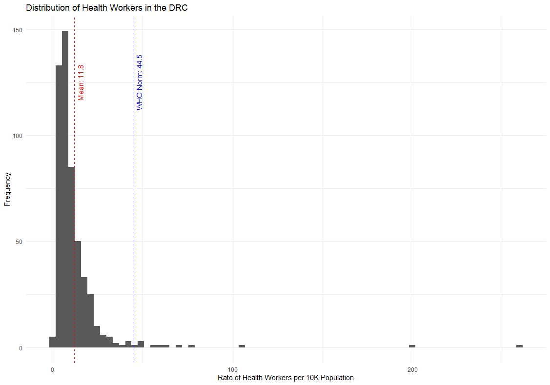
We can draw two conclusions from this.
First, the majority of the DRC's health zones have staffing well below the WHO's recommended minimum number of health workers per population. The DRC needs to increase its public health workforce by 4x to meet the WHO's minimum standard.
Second, the distribution is positively skewed, meaning that large, positive outliers are inflating the average value. In truth, the majority of health zones are below even the DRC average.
Let's investigate this second idea further by breaking down the provinces by those below or above the national average:
# grab the national HRH ratio
hrh_national_ratio <- (sum(hrh.who$total_hwh) /  sum(hrh.who$pop)) * 10000

# classify the provinces by being above or below the national average
hrh.who.mu <- hrh.who |>
  group_by(prov_name) |>
  summarize(
    ratio = (sum(total_hwh, na.rm = T) / sum(pop, na.rm = T)) * 10000,
    who_norm = 44.5,
    dense = if_else(ratio >= hrh_national_ratio, "above", "below")
  ) |>
  mutate(prov_name = as.factor(prov_name)) |>
  arrange(dense, ratio)

# plot a bar chart of the health workers.
ggplot(hrh.who.mu, aes(x = reorder(prov_name, ratio), y = ratio, fill = dense)) +
  geom_bar(stat = "identity") +
  coord_flip() +
  labs(title = "Health Worker Density by Province",
       x = "Province",
       y = "Health Workers per 10K Population") +
  theme_minimal() +
  scale_fill_manual(values = c("above" = "steelblue", "below" = "salmon")) +
  geom_hline(yintercept = hrh_national_ratio, color = "red", linetype = "dashed") +
  geom_text(aes(x = Inf, y = hrh_national_ratio, label = paste("National Mean:", round(hrh_national_ratio, 1))), color = "red", angle = 0, vjust = -0.5, hjust = 1.1)
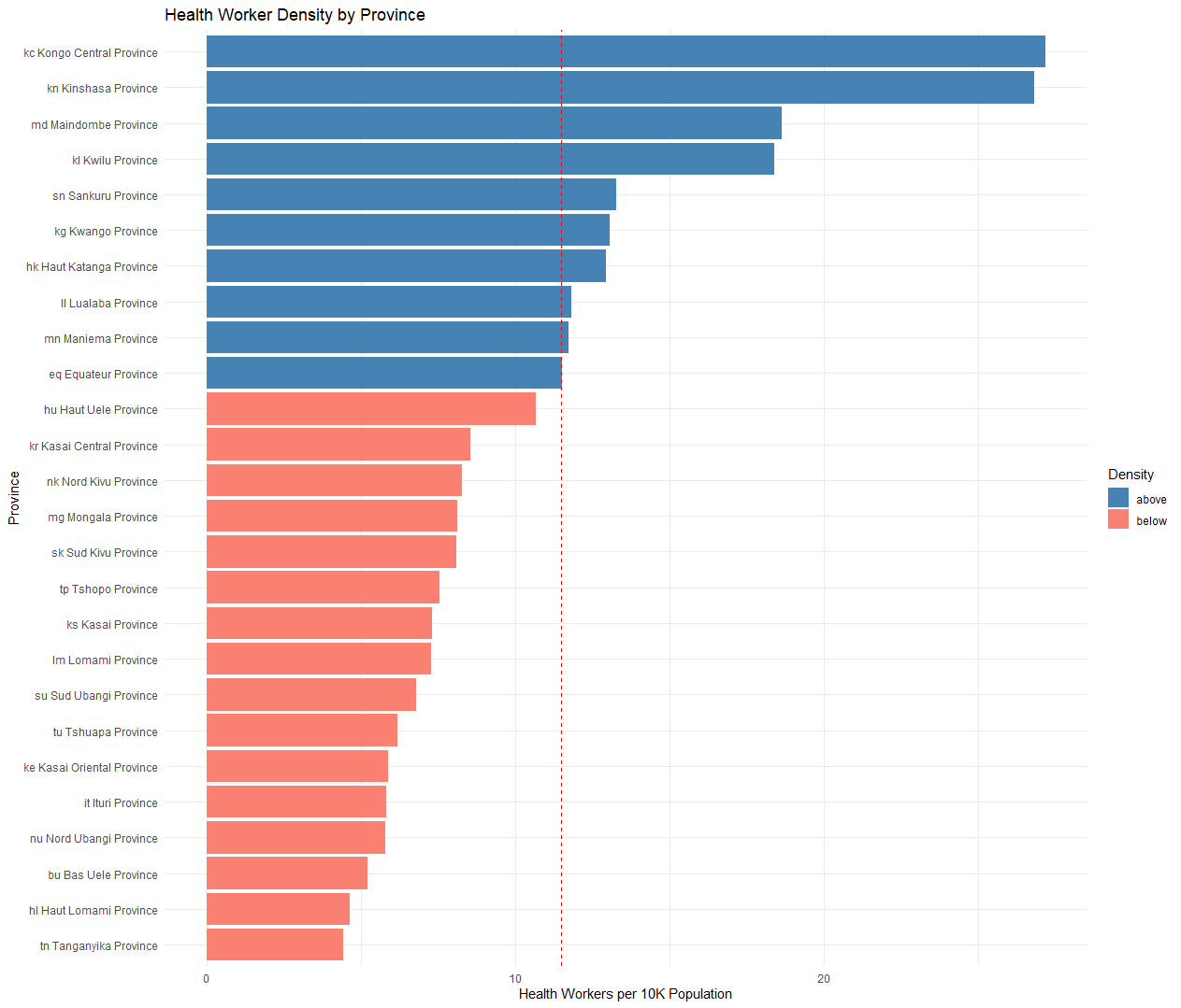
Based on this analysis, 10 provinces set above the national average, and sixteen sit below. Three of the provinces above the national average, Lualaba, Maniema, and Equateur, are "borderline" or sitting just slightly above the national average, while many of those below the national average sit substantially below.
In the future, I'll expand on this analysis with graphical analysis using data from the humanitarian data exchange.
Critiques
There are some valid critiques with this armchair analysis.
We are only using data from the public health workforce, not the private health providers. However, do we really believe the private health workforce to be 4x the public workforce? I would posit that the private health workforce both is smaller than the public health workforce, and clustered in profitable urban areas, rather than equitably distributed to rural areas.
Additionally the analysis hinges on whether the population data and health workforce data is accurate. We used the median value to attempt to account for outliers, but if a health zone is systematically over or under-reporting the population or health workforce statistics, this may cause skewing.